LOTTO Self-Service Terminal
Project overview
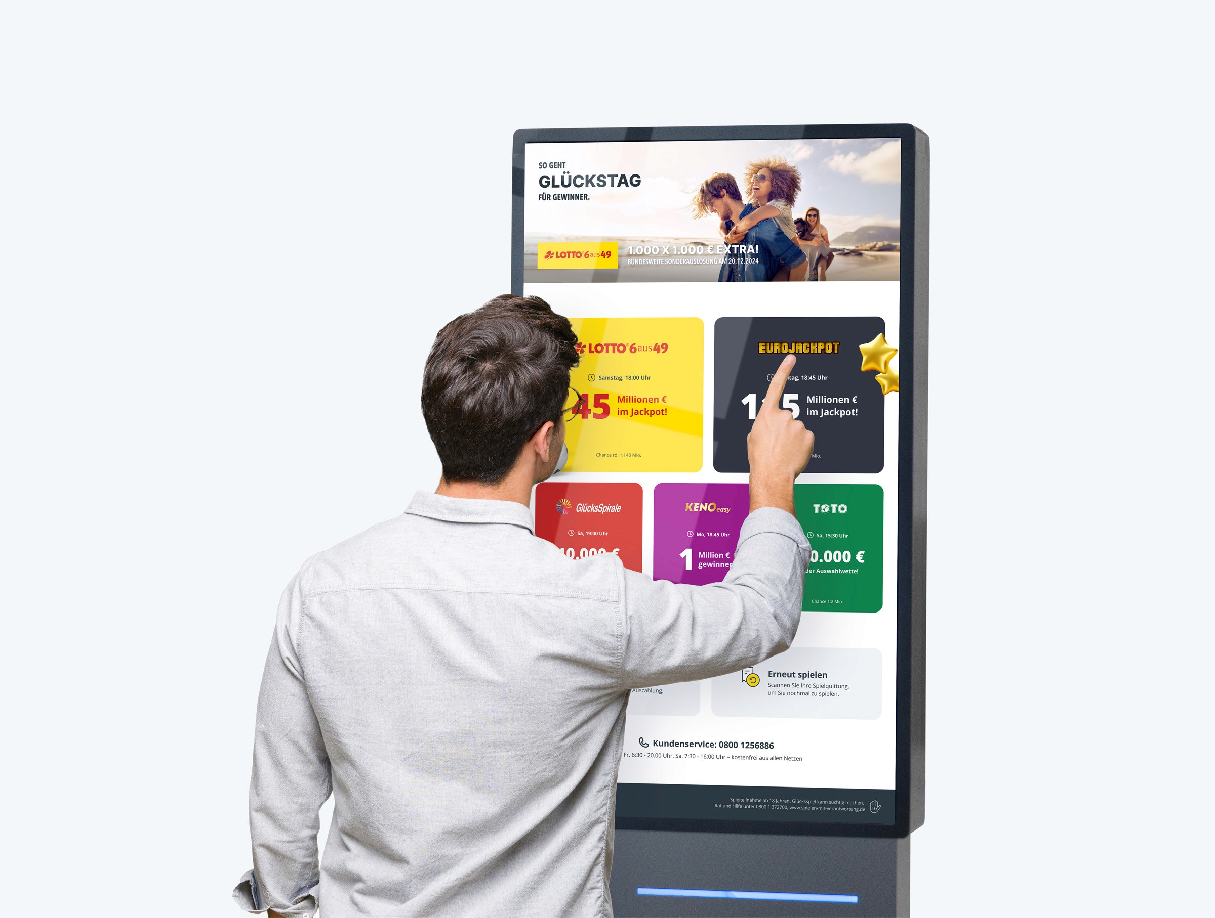
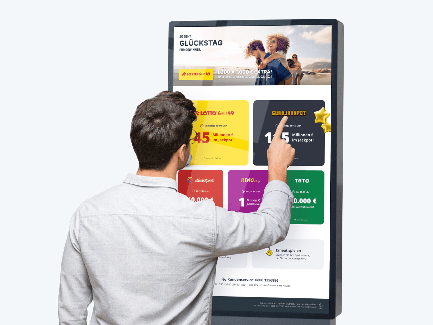
Self-Service Terminal – A modern solution for a convenient LOTTO experience
My Role:
As a UX/UI designer, I was responsible for the entire design process, including conception, prototyping, visual design, and interaction development.
Tools:
Figma: For creating wireframes, interactive prototypes, and final designs.
Adobe After Effects: For animating and visualizing user interactions.
Adobe Dimension: For high-quality 3D elements to enhance the design.
Problem definition
The project faced the challenge of developing a self-service terminal that can serve as a full replacement for a traditional acceptance point – but without staff. The central challenges included:
Identity verification: Ensuring that the legal requirements for age verification are met.
Payment process: Integration of a secure and intuitive cashless payment method.
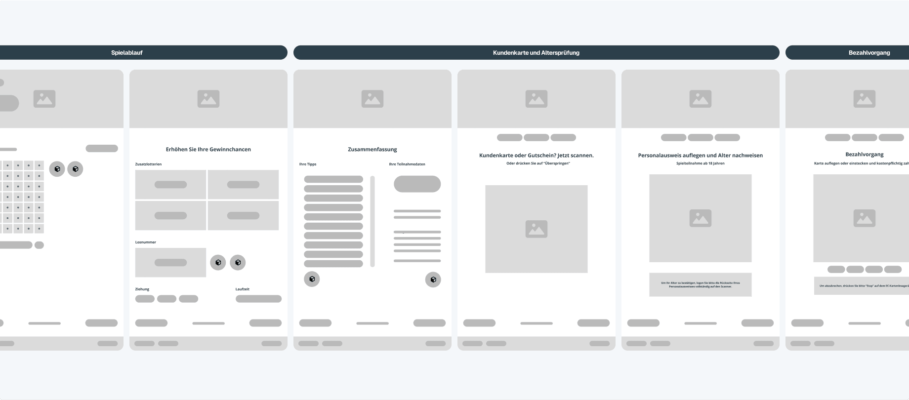
Complete bet submission: Designing the entire process of bet submission, from selecting the lottery to choosing the numbers and determining the duration, so that it works simply, efficiently, and accurately for users.
The goal was to create a solution that not only meets the needs of the target audience but also fundamentally improves the convenience, efficiency, and accessibility of lottery services.
Research
Target Audience and Playing Behavior:
Through comprehensive data analysis, the primary target audience has been identified. A typical representative of this group is Peter, 46 years old, male, who values ease of use, availability, and a secure process. The target audience mainly consists of experienced lottery players who rely on convenient and reliable solutions, especially in areas where person-operated outlets are difficult to access.
Competitive Analysis:
As part of the competitive analysis, existing solutions on the market were examined to identify their strengths, weaknesses, and innovation potentials. It became apparent that the currently available self-service terminals exhibited some significant limitations:
Limited functionality: Most existing terminals only allowed order entry, but no direct payment. Users had to process payments either at separate checkouts or in cash, which unnecessarily complicated the process.
Hardware limitations: Many of the examined terminals used simple hardware solutions like small iPads, which could not provide either intuitive user guidance or an appealing visual design.
Conclusions from the Analysis:
The competitive analysis clearly indicated that there was a gap for a fully-fledged self-service terminal that completely integrates both order entry and payment processing. A user-friendly and high-quality solution that encapsulates the entire process would stand out distinctly from the existing alternatives.
Concept development
As part of the concept development, I examined various alternatives of self-service terminals to identify the best design approaches and functionalities. In doing so, I particularly analyzed terminals from McDonald's, REWE, and dm to understand how these brands implement self-service experiences in their respective industries.
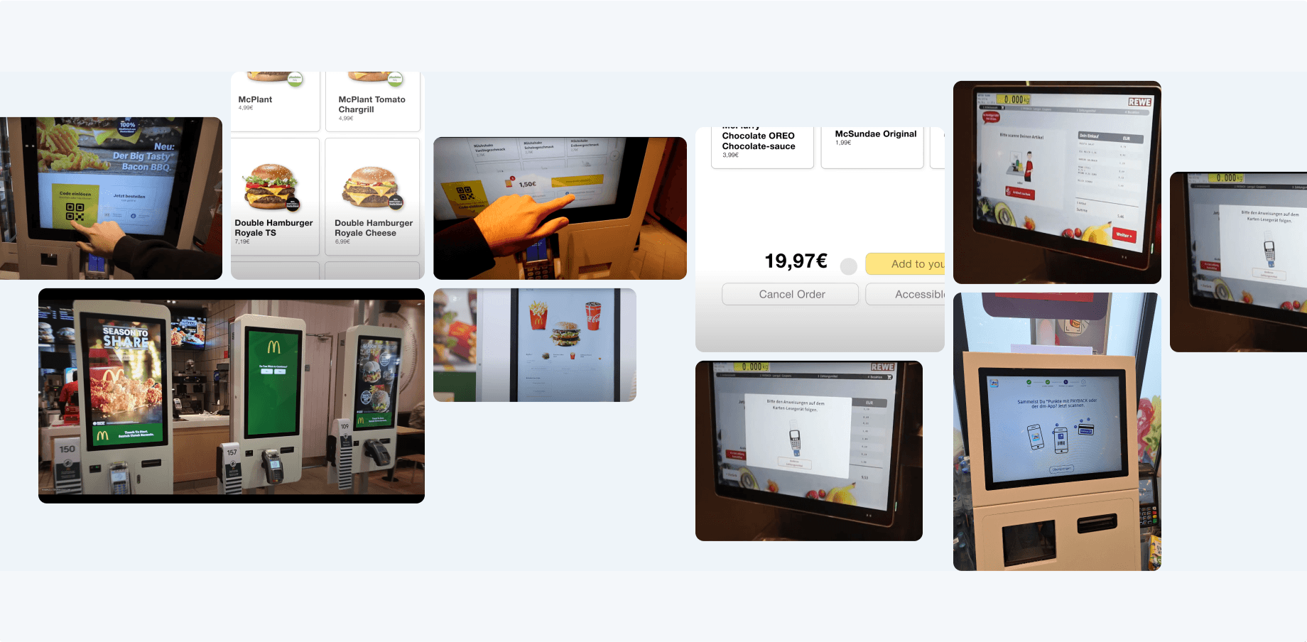
From these examples, I learned how important it is to ensure that user guidance is clear and direct, to avoid unnecessary steps, and to make interaction as efficient as possible. These insights were directly incorporated into the design of the self-service terminal for the lottery project, where I placed special emphasis on a user-friendly interface, an intuitive layout, and a simple payment method.
Design process
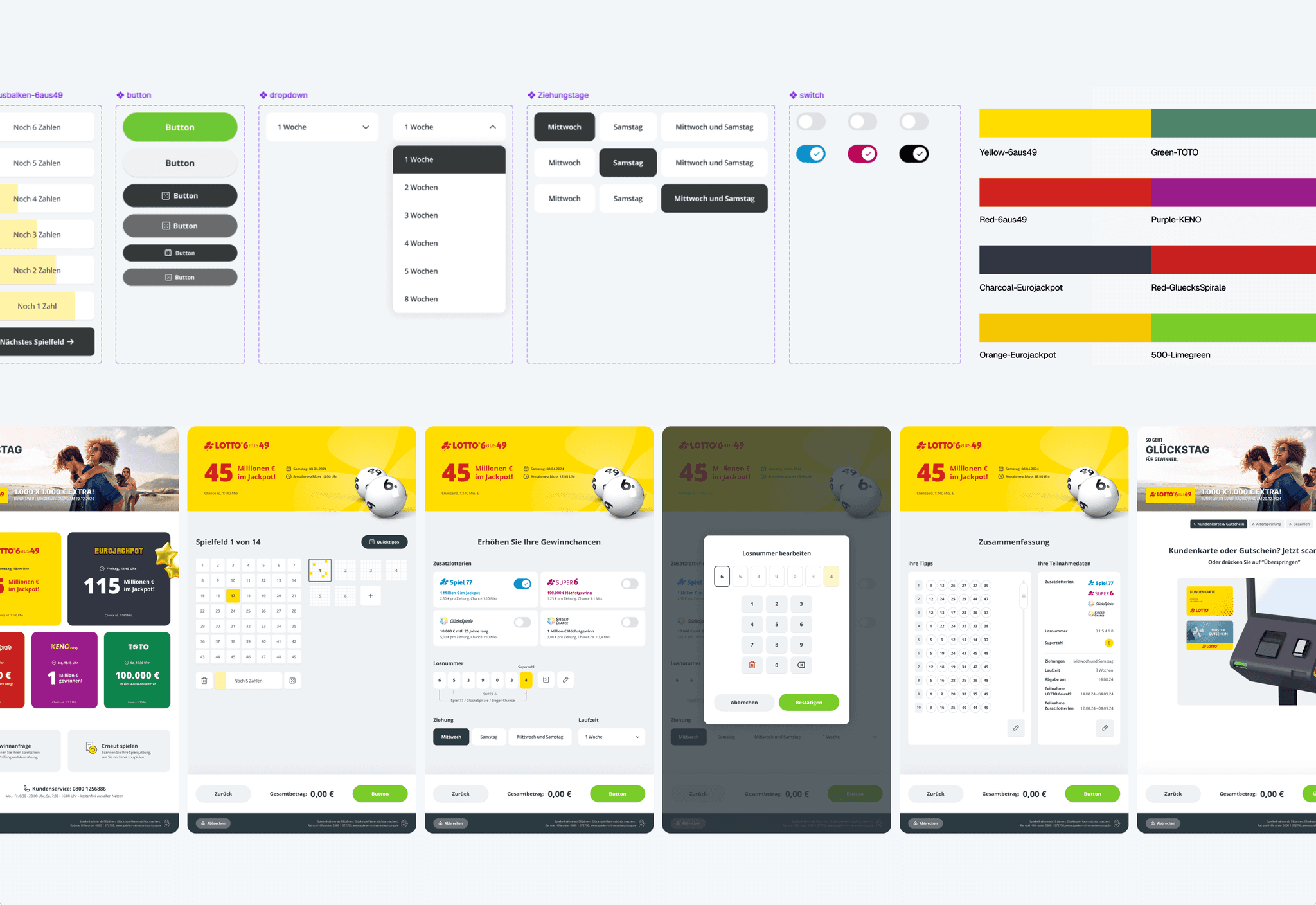
In the design process, the focus was on creating a visually appealing and user-friendly interface that offers users an intuitive experience. Various design elements were carefully selected to convey a clear brand identity while maintaining a focus on usability and functionality.
In the design process, a careful selection of colours, tokens, icons, and typefaces was made to create a user-friendly and visually appealing interface. The colour palette combines bright yellow with neutral grey tones to ensure clarity and high readability. Clear and simple icons facilitate navigation, while a highly legible sans-serif font was used for both headings and body text. The targeted use of microanimations supports the user during the process of playing through to the submission of the game.
Learnings
The design of the tip submission on the self-service terminal posed a challenge, as the process involves several steps – from selecting the lottery to choosing the numbers and the duration. It was difficult to structure this process so that it remained both simple and intuitive without overwhelming the user with too many options.
Learning:
Through testing and iterating the design with various user tests, it became clear that less is often more. It turned out that a clear visual hierarchy and the use of step-by-step instructions were crucial to simplifying the process. Users preferred a clear structure with fewer distractions, which led to clearer user guidance and overall better interactions.